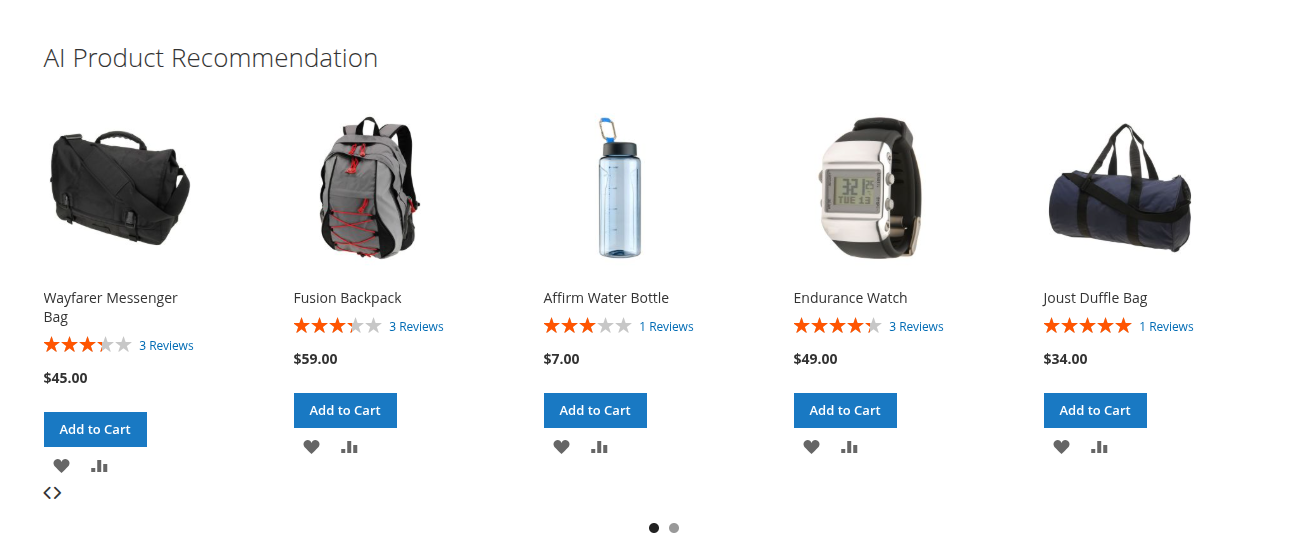
AI Product Recommendation
Extension Installation
For Magento Marketplace Customers
-
Find the Composer name and version of the extension in the extension's composer.json file.
-
Login to your SSH and run:
- composer require mavenbird/magento-2-ai-product-recommendation
- Wait for Composer to finish updating your project dependencies and make sure there aren't any errors.
-
To verify that the extension installed properly, run the command:
- php bin/magento module:status Mavenbird_AiProductRecommendation
- By default, the extension is probably disabled.
- Enable the extension and clear static view files:
- php bin/magento module:enable Mavenbird_AiProductRecommendation --clear-static-content
- php bin/magento setup:upgrade
- For Magento version 2.0.x to 2.1.x - php bin/magento setup:static-content:deploy
- For Magento version 2.2.x & above - php bin/magento setup:static-content:deploy --f
- php bin/magento cache:flush
For Mavenbird Customers
- Extract the zip folder and upload our extension to the root of your Magento 2 directory via FTP.
- Login to your SSH and run below commands step by step:
- php bin/magento setup:upgrade
- For Magento version 2.0.x to 2.1.x - php bin/magento setup:static-content:deploy
- For Magento version 2.2.x & above - php bin/magento setup:static-content:deploy --force
- php bin/magento cache:flush
Configuration Fields
General Settings:
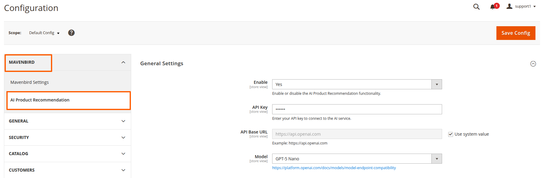
- Stores → Configuration → Mavenbird → AI Product Recommendation → General Settings
- Enable: Enable or disable the AI product recommendation functionality.
- API Key: Enter your API key to connect to the AI service.
- API Base URL: Set the base URL of the AI service (e.g., https://api.openai.com).
- Model: Select the AI model version for generating product recommendations.
Product Related Settings Settings:
- Stores → Configuration → Mavenbird → AI Product Recommendation → Product Related Settings Settings
-
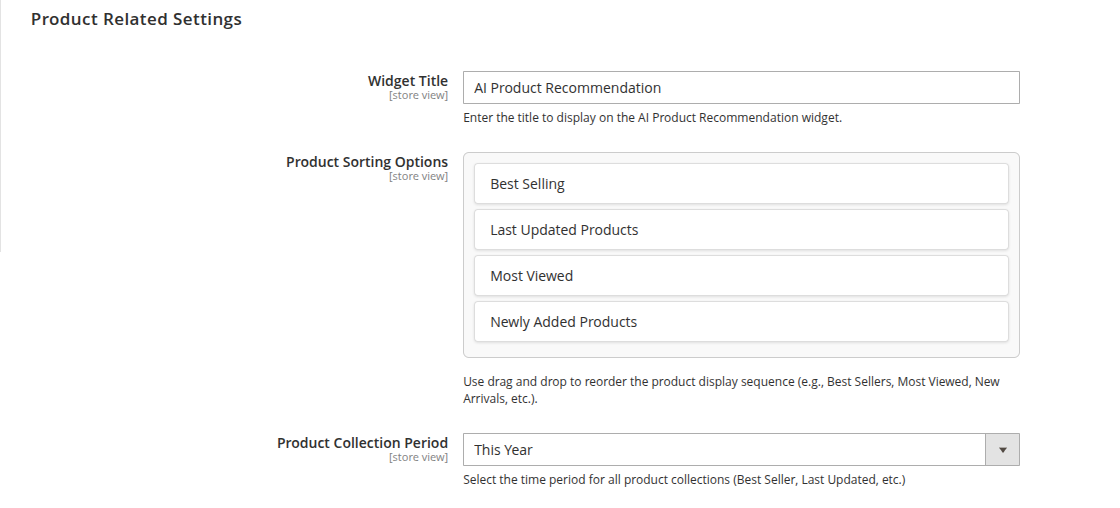
Widget Title - Enter the title to display on the AI Product Recommendation widget. This helps users identify the purpose of the widget on your site.
-
Product Sorting Options - Use drag and drop to reorder the product display sequence (e.g., Best Sellers, Most Viewed, New Arrivals, etc.). This feature allows you to customize the order in which product recommendations appear, making it easy to highlight specific product groups.
-
Product Collection Period - Select the time period for all product collections (such as Best Seller, Last Updated, etc.). This setting determines the timeframe used to generate product recommendations, ensuring the widget displays the most relevant products.
-
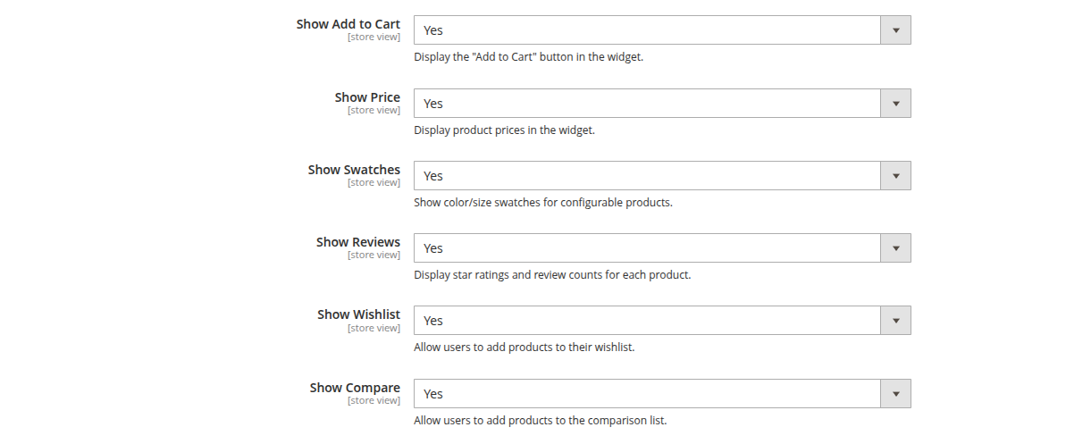
Show Add to Cart
Display the "Add to Cart" button in the widget. Enable this option to allow users to quickly add products to their cart directly from the recommendations. -
Show Price
Display product prices in the widget. This helps users see the cost of recommended products at a glance. -
Show Swatches
Show color/size swatches for configurable products. Enable this to let users view and select product variations (such as color or size) directly in the widget. -
Show Reviews
Display star ratings and review counts for each product. This provides social proof and helps users make informed decisions. -
Show Wishlist
Allow users to add products to their wishlist. This feature lets customers save products for future reference or purchase. -
Show Compare
Allow users to add products to the comparison list. Enable this to help users compare features and prices of multiple products side by side.
-
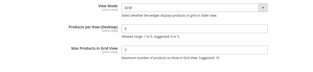
View Mode - Select whether the widget displays products in grid or slider view. Choose "grid" to show products in a multi-column layout, or "slider" to display products in a horizontal carousel.
-
Products per Row (Desktop) - Set the number of products to display per row in grid view on desktop devices. Allowed range: 1 to 5. Suggested values are 4 or 5 for optimal appearance. This setting is only available when "grid" view mode is selected.
-
Max Products in Grid View - Specify the maximum number of products to show in Grid View. Allowed range: 1 to 10. Suggested value is 10. This helps control the amount of content shown at once and keeps the widget visually balanced. This setting is only available when "grid" view mode is selected.
-
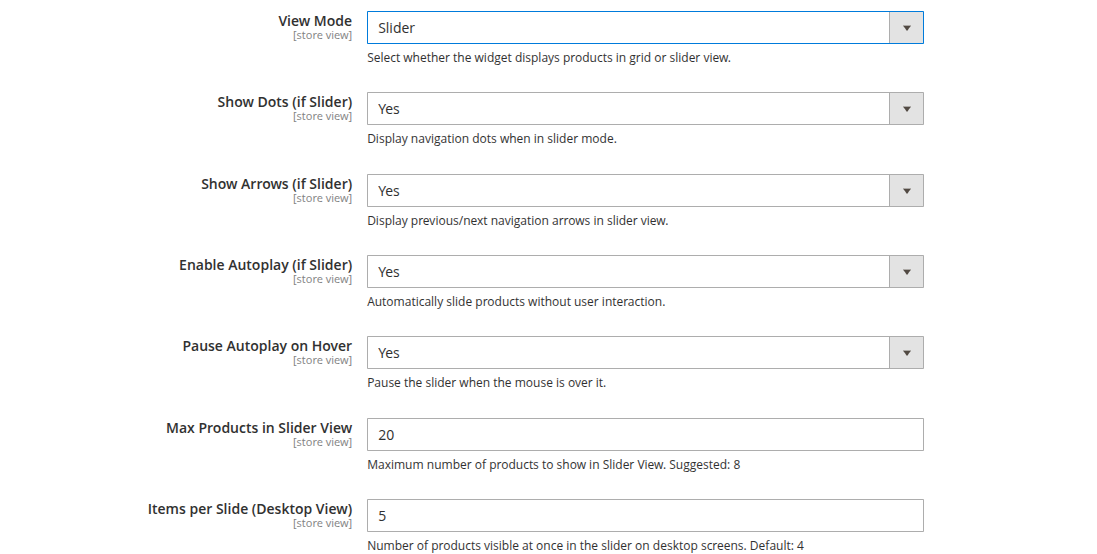
View Mode - Select whether the widget displays products in grid or slider view. Choose "slider" to show products in a horizontal carousel with navigation controls.
-
Show Dots (if Slider) - Display navigation dots when in slider mode. These dots help users see which slide they are viewing and easily navigate between slides.
-
Show Arrows (if Slider) - Display previous/next navigation arrows in slider view. Arrows allow users to manually scroll through the product slides.
-
Max Products in Slider View - Set the maximum number of products to show in Slider View. Allowed range: 1 to 10. Suggested value: 8. This controls how many products are included in the slider.
-
Items per Slide (Desktop View) - Specify the number of products visible at once in the slider on desktop screens. Allowed range: 1 to 5. Default is 4. This determines how many products are shown per slide.
-
Enable Autoplay (if Slider) - Automatically slide products without user interaction. When enabled, the slider will cycle through products on its own.
-
Pause Autoplay on Hover - Pause the slider when the mouse is over it. This prevents automatic sliding while users are interacting with the slider.
Widget Configuration
Adding AI Product Recommendation Widget to Pages
To add the AI Product Recommendation Widget to any page, follow these steps:
-
Navigate to the Page
Go to the page or block where you want to display the AI Product Recommendation widget (e.g., Homepage, Product Pages, etc.). -
Add the Widget
In the page content editor, click on the Insert Widget button, which is available in the WYSIWYG editor. -
Select Widget Type
From the list of available widgets, choose the AI Product Recommendation widget. -
Configure Widget Settings
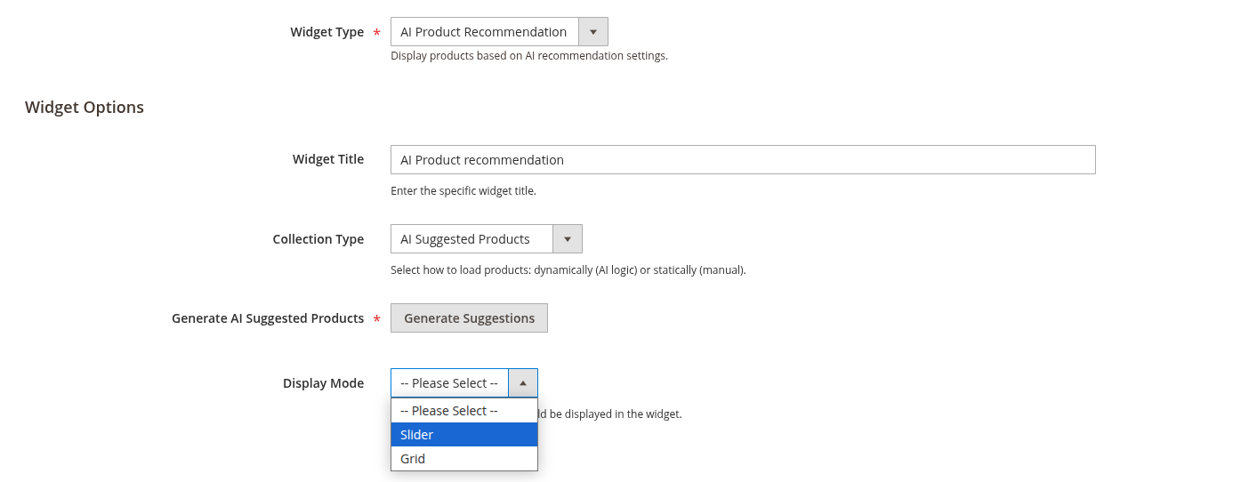
You’ll be prompted to configure the widget's settings:- Collection Type: Choose whether to load the products dynamically (AI logic) or statically (manual selection).
- Display Mode: Choose the display style (Slider or Grid).
- Widget Title: Provide a title for the widget (optional).
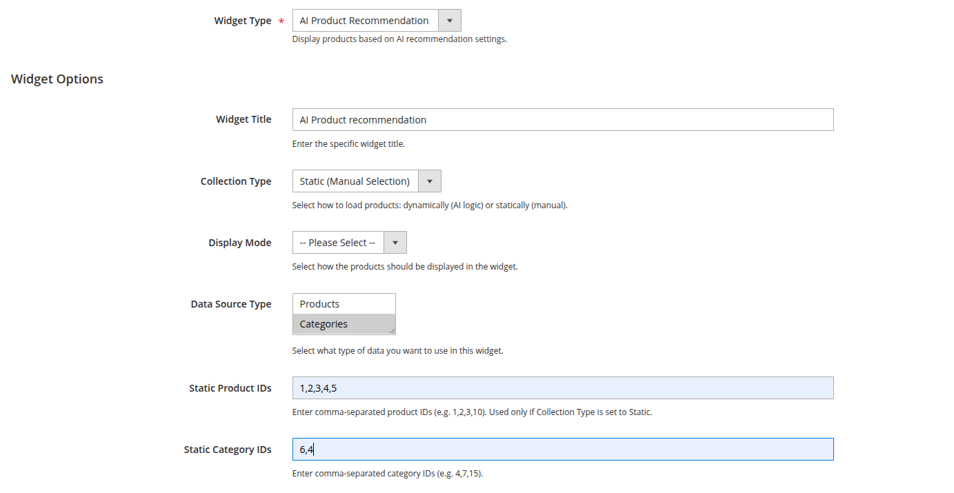
- Data Source: Select the type of data (Products or Categories) to use for recommendations if using Static mode.
-
Customize the Widget Layout
- In Slider Mode, customize the number of products to display per slide, enable autoplay, and configure navigation arrows or dots.
- In Grid Mode, choose how many products to display per row, set a maximum number of products to show, and whether to show the "Add to Cart" button.
-
Save Changes
Once you’ve configured the settings, click Save to insert the widget into the page. -
Clear Cache
Clear the cache after saving the page to ensure the widget displays correctly.
Widget Parameters Overview
-
Collection Type
Choose between Dynamic (AI-generated) or Static (manual) product selection for your widget. -
Widget Mode
Select how the products should be displayed:- Slider: Horizontal carousel of product recommendations.
- Grid: Grid of products in multiple columns.
-
Data Source
Select between Products or Categories as the data source for Static widget. -
Static Product IDs / Static Category IDs
If using Static mode, enter product IDs or category IDs separated by commas (e.g., 1,2,3).
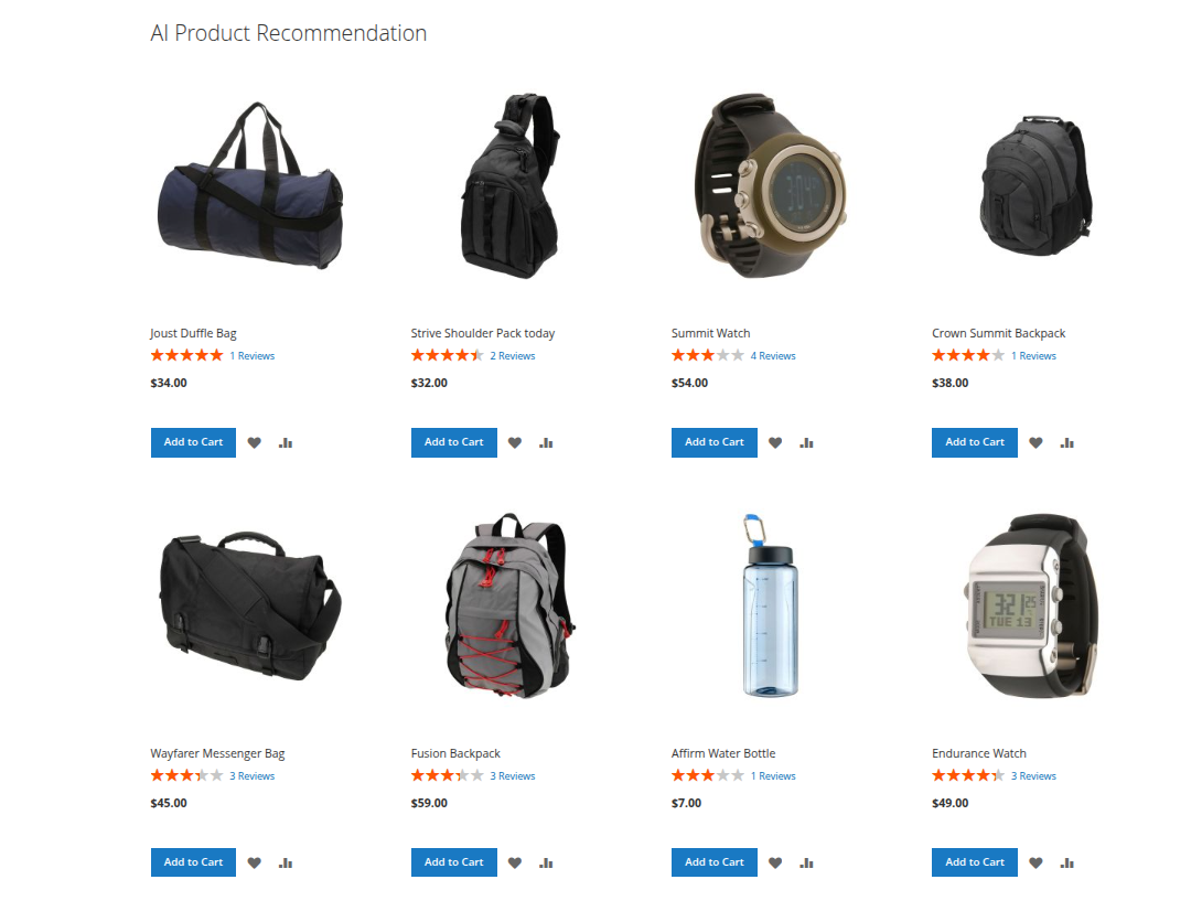
Front-end Grid View
Front-end Slider View